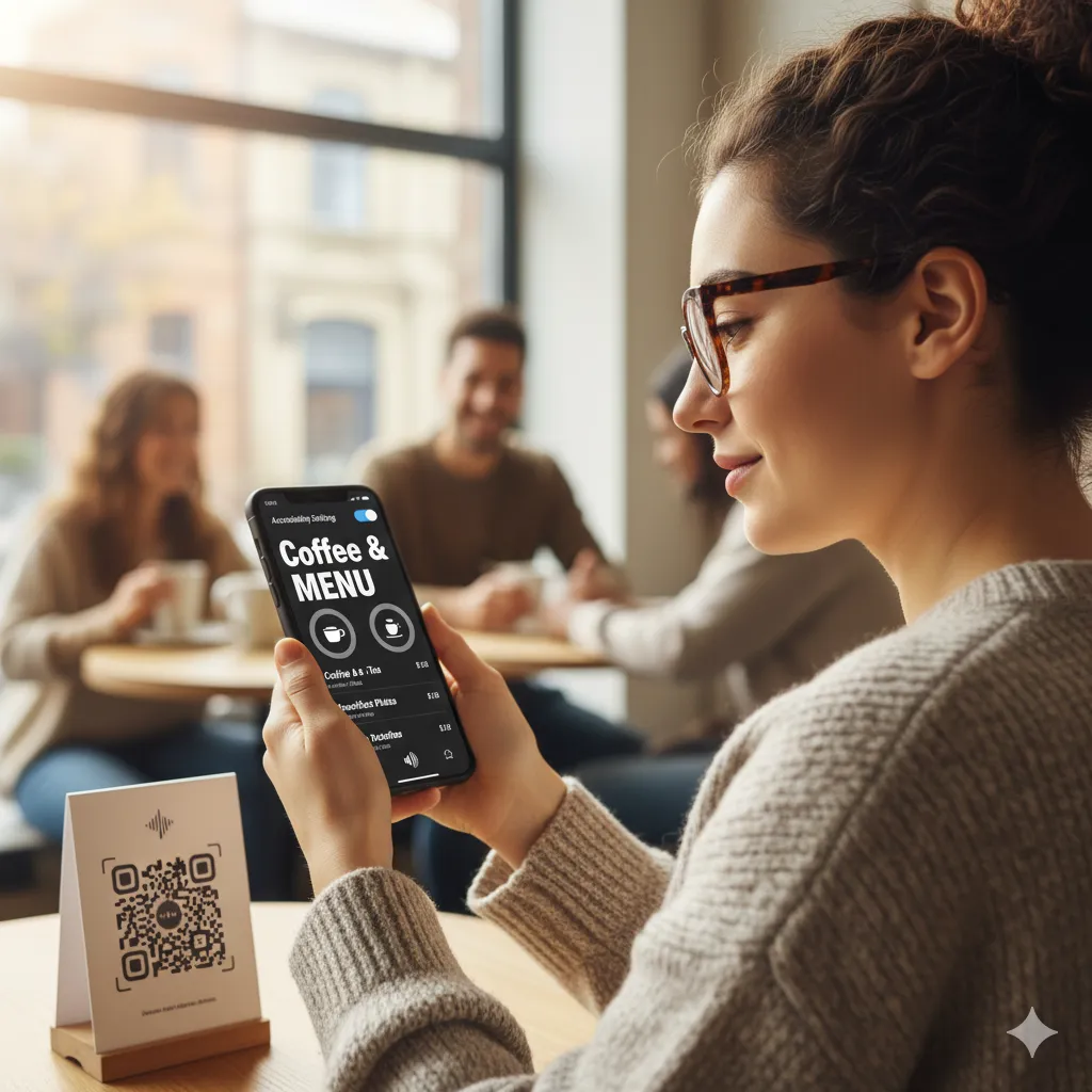
Accessibility in Digital Menus: Ensuring Everyone Can Order with Ease

When we talk about customer experience, it’s essential to ensure that all customers are included. Digital accessibility means designing your QR menu so that people with disabilities can use it. This includes people with visual, auditory, motor, and cognitive impairments.
Why is Accessibility Important?
- It’s the Right Thing to Do: Everyone deserves equal access to services.
- It’s Good for Business: The disability community has significant spending power. An accessible experience can win you loyal customers.
- It’s Often the Law: Many countries have laws that require digital products to be accessible.
Key Principles of Accessible Menu Design
1. Screen Reader Compatibility: Your menu should be compatible with screen readers, which are used by people with visual impairments. This means using proper HTML semantics (headings, lists, etc.) and providing alternative text for all images.
2. High Contrast: Ensure there is sufficient color contrast between your text and background, making it easier for people with low vision to read.
3. Keyboard Navigation: All interactive elements (buttons, links, etc.) should be navigable using only a keyboard.
4. Clear and Simple Language: Avoid jargon and use clear, concise language to describe your dishes.
5. Scalable Text: Allow users to increase the text size without breaking the layout.
How Astro-Menu Promotes Accessibility
At Astro-Menu, we believe in creating an inclusive experience for everyone. Our platform is built with accessibility in mind, following the Web Content Accessibility Guidelines (WCAG). We focus on providing a clean, semantic structure that works well with assistive technologies, ensuring that all your customers can browse your menu and place an order with ease.
By prioritizing accessibility, you’re not just complying with standards; you’re sending a powerful message that you value every customer who walks through your door.